Table Content
Colour psychology in survey design
Understanding the psychology of colours
Colour is not just a visual experience; even more than that it's a psychological one. Each hue in our vibrant world carries with it a psychological connotation, a subconscious message that can profoundly influence our thoughts, moods, and decisions. Welcome to the intriguing domain of colour psychology, and its compelling application within survey design and LimeSurvey.
A quick overview of the meaning of colours
So how does this colour psychology apply to survey design and survey-taking? To find out just that, here is a more comprehensive look at the psychological values of different colours.

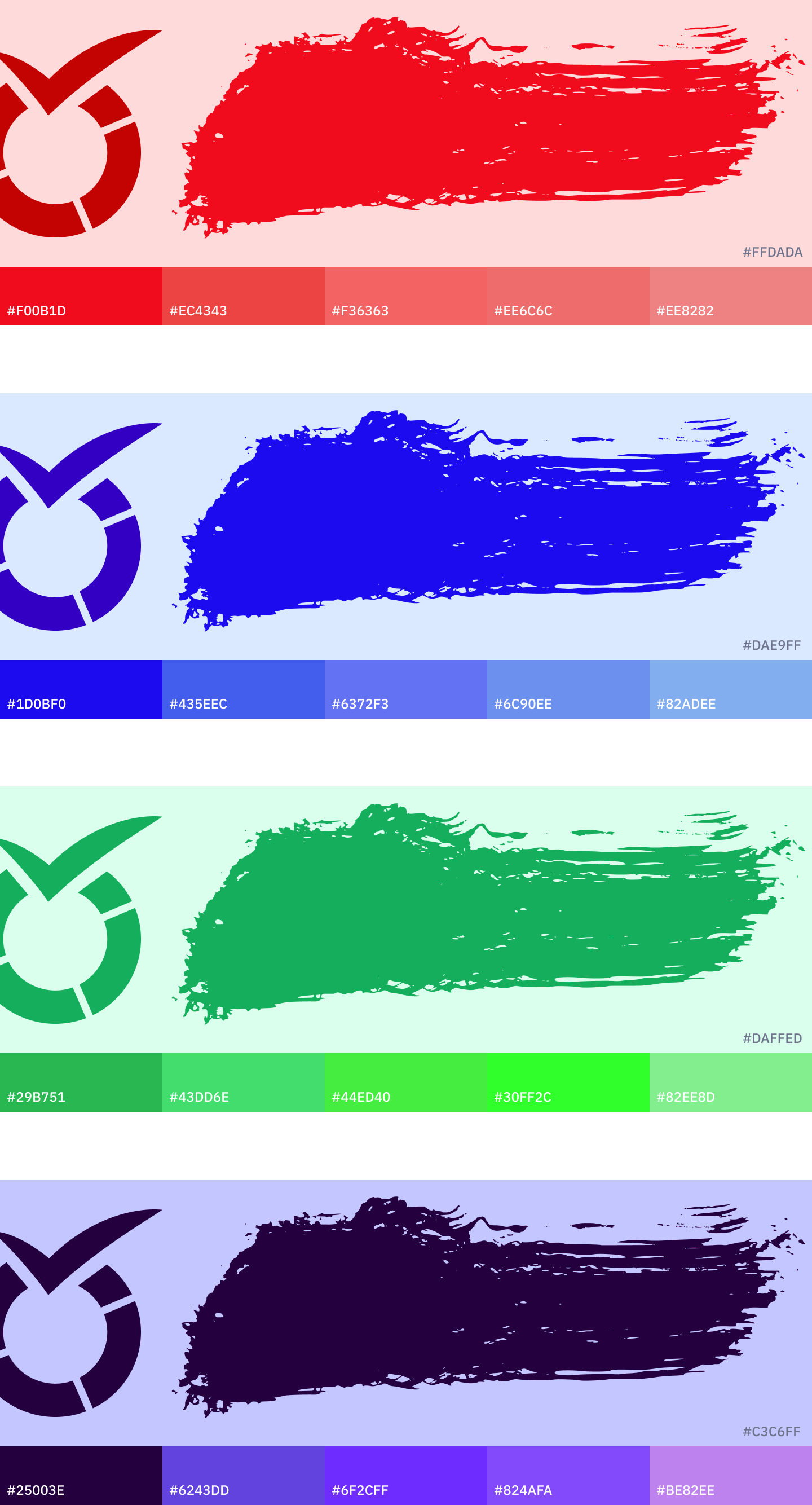
Red
This bold colour is often associated with excitement, passion, and urgency. However, it can also signal danger or errors.
Blue
Known to inspire trust and have a calming effect, blue is a favourite in corporate and tech environments.
Green
This earthy colour evokes feelings of tranquillity, health, and freshness. It's commonly used in environmental and wellness contexts.
Yellow
The colour of sunshine, yellow, stirs feelings of happiness and positivity, but can also signify caution.
Purple
Often associated with creativity, luxury, and mystery, purple can add a touch of elegance and intrigue.
Orange
This vibrant colour is seen as friendly and energetic, often used to signal affordability and creativity.
Pink
This gentle hue is commonly associated with romance, femininity, and sweetness.
Black
Black denotes power, sophistication, and seriousness. In certain contexts, it can also suggest mystery or exclusivity.
White
White typically symbolizes purity, simplicity, and cleanliness. It's widely used in minimalist and modern designs.
Brown
This warm, natural colour is often linked to stability, reliability, and earthiness.
Gray
Gray signifies neutrality and balance. It can also evoke feelings of practicality and timelessness.
Gold
Associated with wealth, prosperity, and success, gold can add a touch of luxury and prestige.
The application of colour psychology in survey design
Colour psychology is a highly interesting topic for any field of use, but how do you use it inside the LimeSurvey application? Let's look at some ways you can use colour psychology to benefit your surveys, considering different overarching themes:
Health and wellness surveys
Use soothing colours like blue and green to create a calming environment. Accentuate with white to denote cleanliness and purity.
Employee engagement surveys
Warm and friendly colours like orange can encourage openness and honesty. Use blue to foster trust and loyalty.
Customer satisfaction surveys
Colours consistent with your brand can enhance recall. Use red sparingly to highlight important areas without inducing stress.
Market research surveys
Use neutral colours like gray or white to avoid influencing the respondent's feelings about the product or service being evaluated.
Event feedback surveys
Match the colour scheme of the event to maintain consistency and evoke memories. Vibrant colours like yellow or orange can encourage positive feedback.
Academic surveys
Blue can inspire trust and help maintain focus, while green can stimulate creativity and encourage innovative thinking.
Environmental surveys
Use earthy tones like brown or green to align with the theme. Blue can symbolize water and sky, broadening the environmental connection.
Product review surveys
Colours like black, purple, and gold can underscore the premium nature of the products. Also, it is usually recommended to stay within the visual identity of your brand to elevate brand awareness and recognition for your specific product.
Non-Profit and social cause surveys
Colours that align with the cause or the organization's logo can enhance the connection. For instance, pink can be used for women's causes, green for environmental causes, etc.
Youth and trend surveys
Bright and vibrant colours like red, yellow, or pink can capture the energy and dynamism of youth.
This is just a small fraction of possible areas where the use of colours can be applied. However, determining the extent of benefits or detriments is strongly case-dependent. Factors that determine whether colours in surveys lead to higher or lower response rates and better or worse response quality are characteristics like target audience culture, residence, age, and gender.
Therefore, here are a few tips for using colours in your next survey:
6 tips for using colours in surveys
Nevertheless, we have gathered 6 valuable tips that can give you a good orientation for the usage of colours in surveys to ensure a more strategic approach.
- A/B Testing: If you are not certain whether to integrate specific colouring into your survey or not, there is always the possibility of A/B testing. Set up the same survey in different variations, i.e., split a survey into one with colour options and another with a more neutral look and feel. Test these on two smaller subgroups of your sample group to get an idea of which version performs better.
- Readability: It is essential that the text in your survey is easy to read. The lighter the font colour the harder it becomes to read. If you decide to use font colours, select darker colours, as they facilitate readability.
- Minimalist Design: When in doubt, go for a minimalist design when it comes to using colours in surveys rather than a maximalist design. Too many colours and images may create a cluttered effect, which looks unprofessional.
- Colour Contrasts: Make sure to apply colour contrasts in case you are working with background colours and font colours at the same time. I.e., avoid using the same colour for both elements, otherwise, the text might become partially or fully invisible.
- Colour Intuition: Avoid a response bias by making a conscious effort to not use colours in a misleading way. For example, a coloured response scale should go hand in hand with an intuitive colour distribution. I.e., a more positive response expression (e.g., “Strongly agree”) should use green colour shades and not red ones, and vice versa for a more negative response expression (e.g., “Strongly disagree”).
- Colour Harmonisation: From a design perspective, it makes sense to combine colours that harmonise well to maximise the quality of the survey feel. For instance, shades of the same colour will harmonise better than using two or more bright colours from different ends of the colour palette.
Always keep your target audience in mind!
For example, the creative platform Shutterstock, which provides images and videos to the public, has a good grasp on colours in media, as well as the emotional effects of colour, posted in a clear and insightful article on the Symbolism of colours and colour meanings around the world.
Always keep your brand, the area in which your brand is active and the target audience in mind when choosing a colour theme for your surveys. With these tips, you are good to go and can design your next survey the right way.

