Table Content
3 Ways to Present Surveys to Your Audience
You can show your survey on multiple pages, i.e., one question per page, which is called paging survey design.
What seems like an easy decision at first will require some further consideration when looking closer at this design topic. In light of the availability of different technical devices to take surveys on nowadays, such as desktop computers, tablets, or smartphones, formats may appear more advantageous on one device, yet more disadvantageous on another device. This adds extra complexity to the survey design.
Researchers have been testing and evaluating this design question for years now by examining key metrics such as bounce rates, completion times, and rates, as well as item nonresponses. Insights indicate that surveys taken on desktop computers do not differ significantly for scrolling and paging designs with regard to completion and bounce rates. Merely, a tendency to skip certain questions was discovered for scrolling survey designs which could have had any number of reasons such as a mental overload, boredom, or other problems connected to survey fatigue.
Tips For Different Survey Design Formats
Nevertheless, scenarios can be created within which a certain design format may be more suitable than others due to the underlying survey conditions. This leads to the following tips for the usage of different survey design formats:
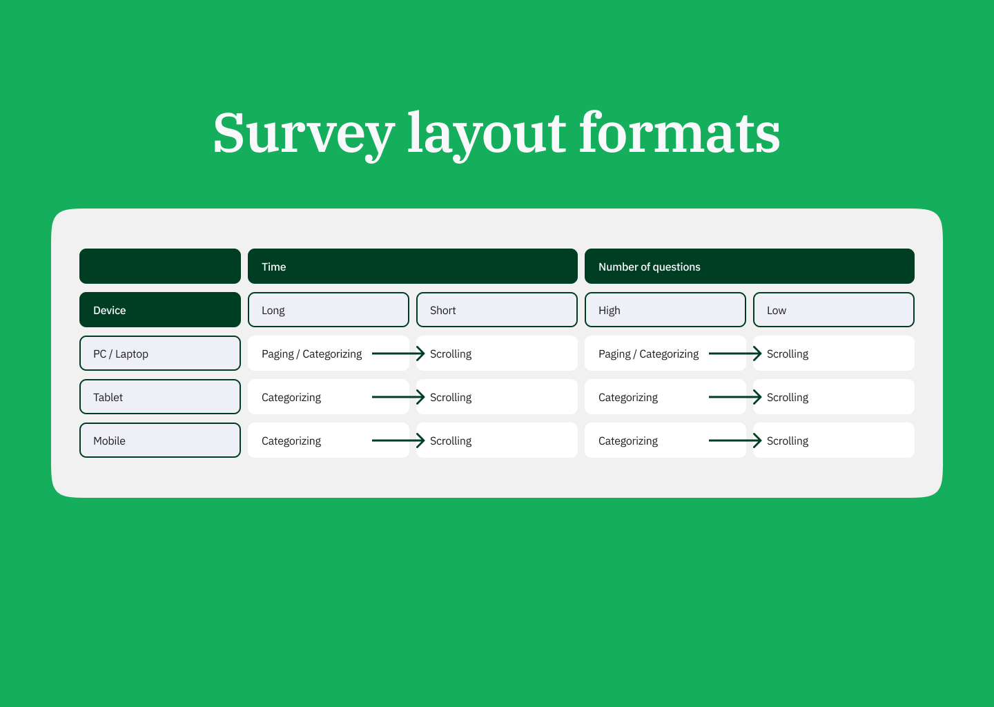
- In general, if your survey is short in terms of the time it requires to be completed, as well as a low number of questions, the recommendation will always be to use a scrolling design to keep the survey short, regardless of the device used. A paging or categorizing design will spread questions over several pages and require respondents to click on the next button as well as to adjust to the subsequent page(s), which prolongs a survey. This will almost always exhaust or lower respondents’ interest potentially resulting in lower completion or higher bounce rates.
- A paging design usually only makes sense if you have a long survey that is to be taken on either a desktop computer or a laptop, as these devices possess larger screens, as well as allow for faster cursor movements and clicks. This way, surveys can be completed in a more convenient manner when shifting from page to page.
- Obviously, the aforementioned paging design can also be replaced by a categorizing design which is the more elegant way as it groups question subtopics to facilitate respondents recognizing logical connections between questions.
- Because tablet and smartphone devices have smaller touchscreens, a categorizing design should be used with long surveys, as it would minimize the negative effects of both pure paging and scrolling designs. In the categorizing design, fewer clicks and new page loads are required than with the paging design, as well as less scrolling and information overload are present than with the scrolling design.
- The advantage of paging and categorizing design is perfectly clear: every time a respondent completes one or a few questions on a page and clicks the next button, this data is submitted and saved, even if the respondent drops out on the subsequent page. If a respondent completes the same amount of questions in a scrolling design and drops out without submitting, all that data is lost. In this scenario, paging and categorizing designs are more valuable as partial data may still deliver important insights.

Conclusion
In the end, it all comes down to how well you know your target audience. The more you find out about devices used and survey perseverance, the better you can suit your survey design to achieve the best results.

